
This blog served as a communal webspace for a senior Corporate Identity course at Kent State University. The seniors were active authors on the blog and were largely responsible for the content.
Please contact me if you have any questions.
Wednesday, August 25, 2010
Sunday, December 6, 2009
Ain't that Splendid


 Just a quick look at how simple type and color can follow through to tie a whole system together. Nothing fancy with this system but it's clean, effective, and consistent.
Thursday, December 3, 2009
Sunday, November 29, 2009
Could this be the new identity for the 2014 Winter Olympic Games in Sochi, Russia?
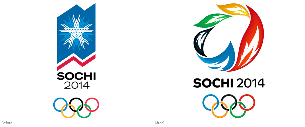
After reports of a closed press conference Friday in Moscow, images have begun to surface of what might be the new Olympic Games logo. Saying goodbye to the snowflake design from the bid, the unconfirmed logo features five torch flames (or leaves? feathers?) formed into a ring formation and set in the Olympic colors. An official announcement is to be made next week (November 30th) at the Red Square in Moscow—so we’ll find out the details soon enough.
Here's somewhat of an explanation for the new graphic system:
"Khorovod [a russian traditional circledance] is a symbol of unity. The logotype consists of palekh-stylized [russian national folk art] firebirds’ feathers in a round dance.
Firebird is a slavic fairytale character, symbol of fire, light and sun. Young men had to find firebirds’ feather in order to complete the challenge.
Since the beginning of Olympics champions had been given the highest honour to be awarded by wreath. Five feathers form laureate wreath which symbilises five continents as in the Olympic sign."
I'm personally not a fan.

They still exist?
During my trip through branding blogs, I was reminded of one of the giants of yesteryear. AOL is back with a whole new look. Designed by Wolff Olins, the agency that came up with the much-derided logo for the London 2012 Olympic Games. The intent is for Aol. (no longer AOL) do differentiate from parent company Time Warner.
The Aol. will always remain the same in all instances, but the backgrounds will change dependent on the instance. There is no official date for the public roll out, but if you are like me, you will never see it in place. I was shocked to hear that they were still in business.
Friday, November 27, 2009
The Persuaders
This is a PBS Frontline documentary that takes an analytical and critical look at the advertising industry. It is broken down into 6 chapters that range are about 13 minutes each with only one clocking in at 18. If you have the time it is definitely an interesting look into the advertising world but I feel like Chapter 2 - Emotional Branding is worth the time to watch. They delve into various brands such as Nike and their "Just Do It" campaign and also touches on a start up airline company call Song and the steps they took to give the company a brand.
Subscribe to:
Posts (Atom)