
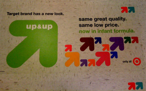
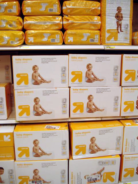

As if we needed any more proof that the venerable patron saint of mass consumer design, Target, attracts designers, my inbox has been jumping with designer e-mails about the new look and name of its private label brand: Up & Up. The chunky arrow logo is replacing Target’s red bulls eye in all the products in the health and beauty care category, from diapers to sunscreen lotions. As CNNMoney, one of the first to pick up the story, reports, the new design is just beginning to be rolled out and by the end of the year there will be 800 Up & Up products, which are typically priced 30% below brand names. And in this rough economic times, 30% less to pay for anything is, well, right on target. One of our undisclosed tipsters says the design has been done by Wolff Olins, who has Target listed in their clients page, so it may just be right — of course, a hundred other design firms have Target listed in their client page, but still.
Typically, I really like Target's branding efforts, ,like Archer Farms, I think it's really nice. However, I feel like this Up & Up business is a silly "micro-brand" within a pre-existing brand. I LIKED the fact that I was buying generic soap but it still looked nice. To me this feels like an admission of shame/guilt on the part of Target products, as if they weren't good before because they were Target brand, like they need to cover up their product origins or something. I guess I like Archer Farms because I knew it was generic, but didn't realize it WAS Target till later on. i guess I have a bit of a double standard going, but...whatevs. Also, the arrow in this campaign feels...incredibly plump. And while I like it in the first image, in this sortve cloud of size contrasting arrows, by itself...it feels a bit lumpy. Though I do like the color, and the type is nice... I don't know, it is a nice system, but I suppose conceptually, I am opposed to it.
ReplyDelete