
Apparently I didn't get this right the first time I posted this. So I'm trying this again.
In 1987, two guys visited me with the intention of launching a new beer brewed in Brooklyn. Tom Potter, an investment banker, and Steve Hindy, a journalist, were passionate about the possibilities. They knew their history: At one point, Brooklyn had over 100 breweries, which had shrunk to none. Since then they've had incredible success, growing in productivity and reputation. Nice guys, great beer.
It all began with the logo itself which was intended to produce a reference to the old Brooklyn Dodgers before they decamped for Los Angeles. We've designed all their packaging, communications, and advertising from the start.
It all began with the logo itself which was intended to produce a reference to the old Brooklyn Dodgers before they decamped for Los Angeles. We've designed all their packaging, communications, and advertising from the start.
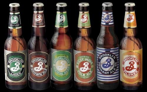

I always like these packages when I see 'em. The use of color and pattern are really nice. The Penant Ale sorta sticks out...but it all looks really good. I am a particularly large fan of the pilsner, though it got cut off in this photo.
ReplyDeleteThe pennant ale is the most true to where the design came from, being the Brooklyn Dodgers as a reference. I'm a huge fan of the IPA though.
ReplyDelete